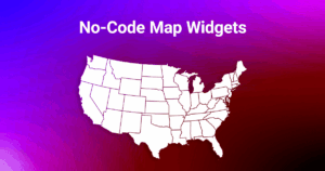
Creating an Interactive Map of FIFA World Cup Best Results
This article provides a quick guide on how to create an interactive infographics that displays the best result countries ever achieved in FIFA World Cup (data does not include recent championships).

Starting from scratch, the entire process takes as little as 15 minutes.
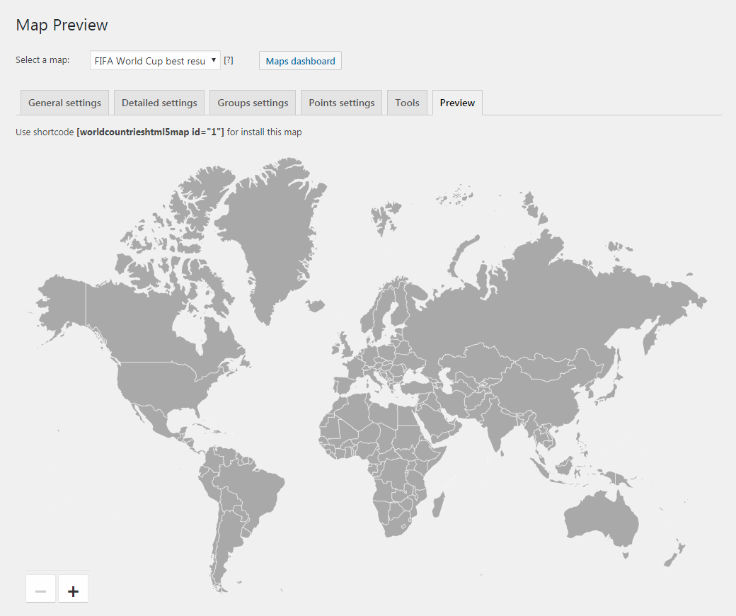
The resulting map is shown below
Some notes
Here, we used the World Map plugin for WordPress that features clickable countries. As for championship results, we have made the following presumptions: Great Britain is marked as a champion even though four countries actually represent GB: England, Scotland, Wales, and Northern Ireland. Since England was a champion in 1966, we mark Great Britain as a champion. Also, we do not distinguish the sports results of such now non-existing countries as West Germany, East, Czechoslovakia, USSR, and Yugoslavia.
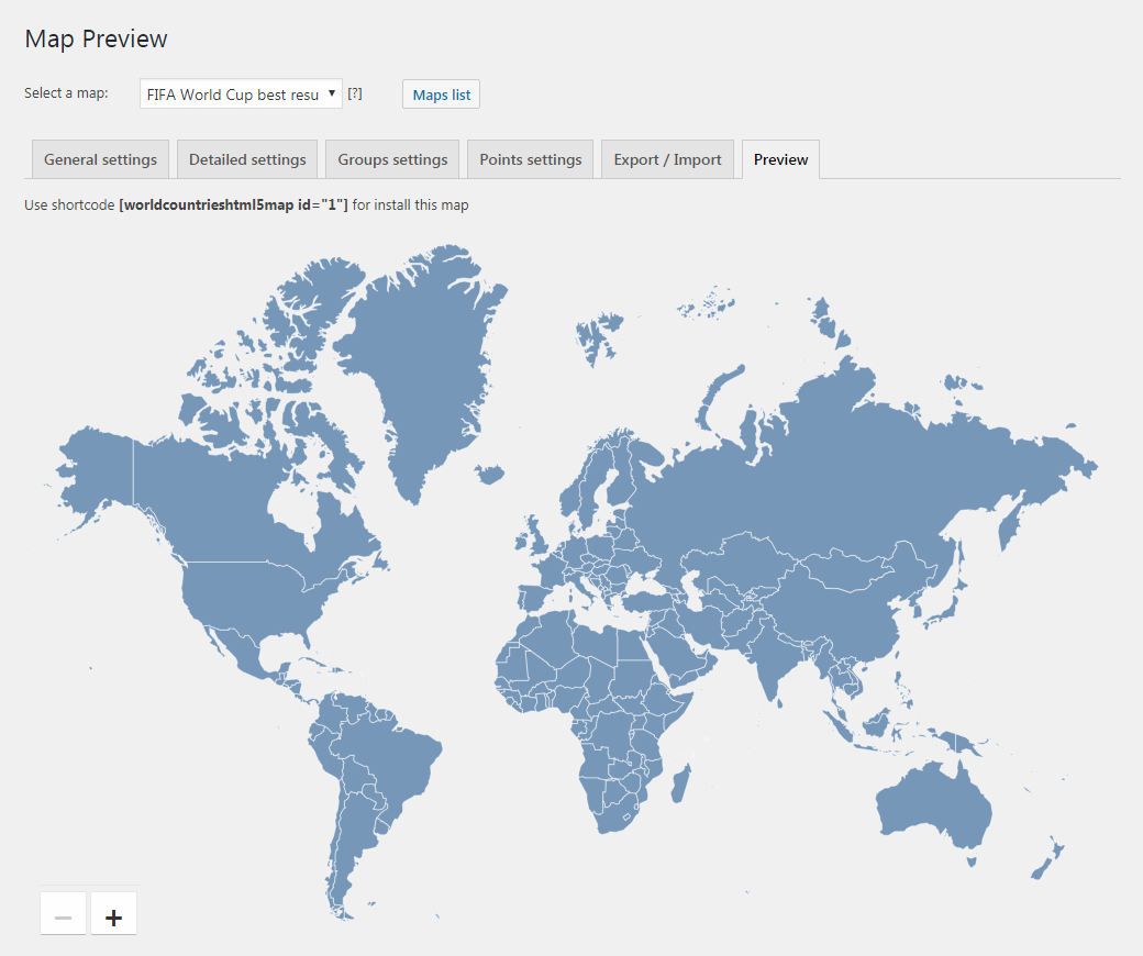
Creating a FIFA best results map
So, how can you create such a map? Assuming you have installed the plugin and familiarized yourself with its settings, the first thing you should do is create a new map in the plugin. Let’s name it “FIFA World Cup best results”. By default, the entire map has a blue color. To preview the map with its current settings, switch to the “Preview” tab. Also, on this tab, you can find a shortcode to paste the map onto any page of your website.
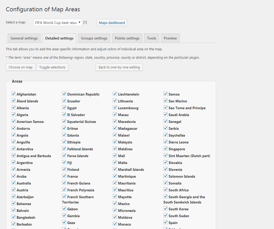
Change the colors of all countries to gray. Then, we will colorize individual countries that ever participated in the World Cup. Conveniently, editing countries one by one is not required – thanks to the “Bulk Edit” function you can change the color of multiple countries in one go and several clicks.
When you click the “Bulk edit” button, a checkbox form appears. Here, you can select countries to which the settings that should be applied. As you remember, we want to make all countries gray. So, we just invert the selection with the “Toggle selections” button. See the screenshot.
Now, here is what we have got:
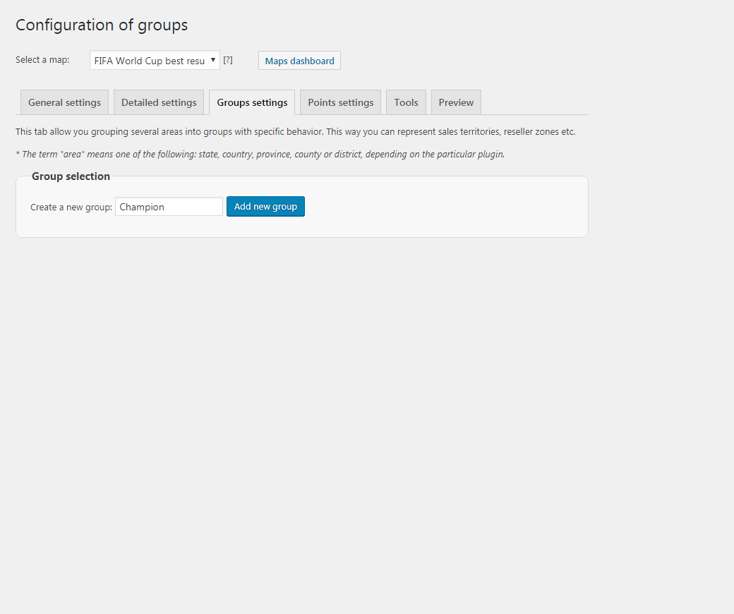
Country Groups
Then we need to colorize countries depending on their best World Cup results. The easiest way to do this is to use our plugin’s unique feature – grouping countries. Here is how it works.
Each country ever participated in World Cup achieved one of the following results: Champion, Finalist, Semifinals, Quarterfinals, 2nd Round, 1st Round. Hence, we need to create the same groups and fill each group with appropriate countries.
A huge advantage of this method is that it allows for easy modification of the infographic whenever this is required. Indeed, adding a new participating country requires merely editing a certain group and adding the given new country to it.
So, let’s create a group. On the “Groups” tab enter the name of the first group, “Champion”, then click “Add new group”.
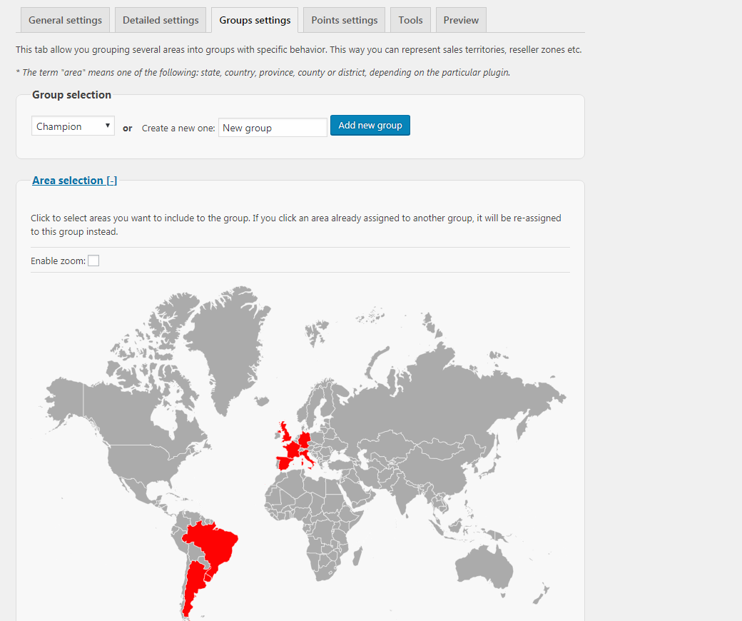
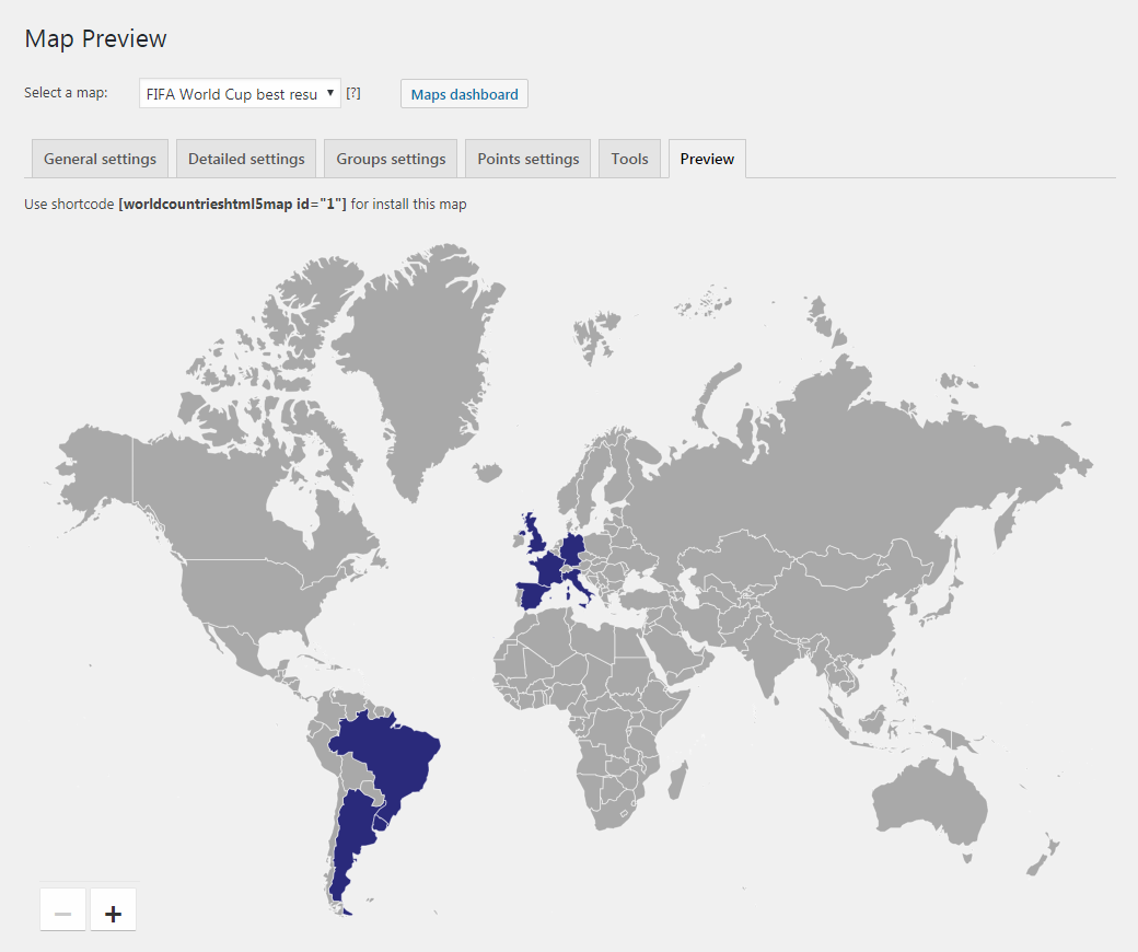
This will unfold the detailed settings section. Here you can select countries to include in this group by simply clicking them on the map. In different years FIFA champions were Brazil, Germany, Italy, Argentina, Uruguay, France, England, and Spain. Select them on the map.
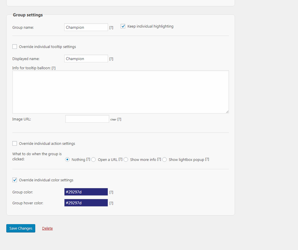
Scroll down to the “Group settings” section. Enable the “Keep individual highlighting” option. If turned on, this option keeps the selection of each country individual when a user clicks or moves the mouse to countries in the group. Otherwise, the entire group is highlighted and selected.
In the same section configure the colors of the Champions group.
Save changes and switch to the “Preview” tab to check the result.
Looks good so far. Now, we basically need to repeat the above for other groups: Finalist, Semifinals, Quarterfinals, 2nd Round, 1st Round. Save changes and check the map on the “Preview” tab:
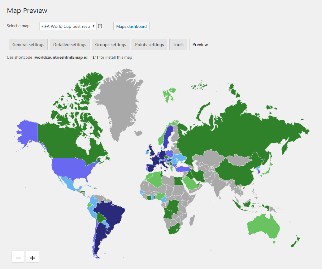
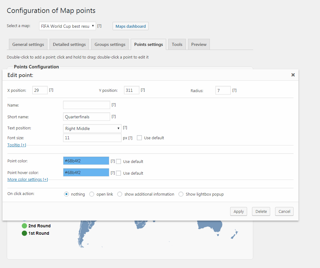
Wow! That’s quite impressive albeit not very informative for now. Indeed, there is a place to improve FIFA’s best results map. Let’s add a map legend somewhere on the map that would explain which color corresponds to which World Cup result. We’ll use the “Points” tab for that. Double-click the map to add a point. A typical use of points is to mark cities on the map, but we’ll use them to make a legend. Configure points so that their colors matched the colors of our groups and give them corresponding names. You can adjust fonts, and size and even assign some click action to the point (which we do not need here, though).
After adding all points, we end up with the following infographics.
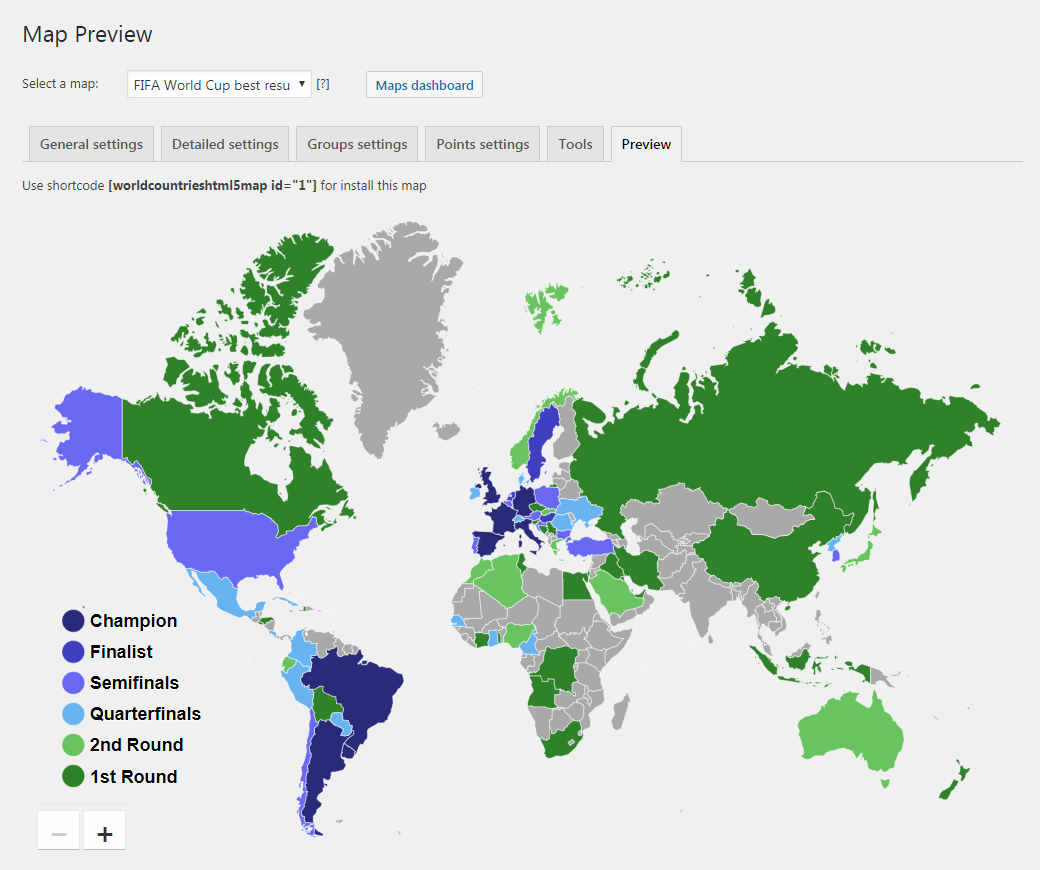
Perfect! Now, we can publish the map. Or we can make it even better, for example, by adding tooltips to countries to display the years each country achieved its best result in the World Cup. You can also add a link to each country so that clicking that country would open some detailed information page with some description of matches played by the country and other related info.
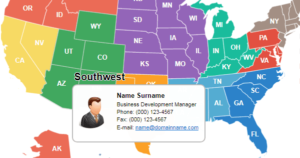
This is another post about infographics in our blog. If you happened to miss the first one, here it is: «Using HTML5 US Map plugin to create infographics».
So, as you see, creating interactive infographics is quite simple when you have the right tool.